Monday, 29 November 2010

Weather forecast week commencing 29/11/10


As we are due to film our final sequences to finish off our trailer this week and that some scenes are to be filmed outside, we researched into the weather forecast, so we know what days to film on. If the weather forecast changes on the day of filming, we have made a contingency plan to adjust to this, for instance some scenes that were meant to be filmed outside will be adapted to the inside.

Sunday, 28 November 2010

Editing techniques and effects of horror films

Horror films have always been extremely popular and have generated huge amounts of profit for the worldwide film industry. For example, Halloween, Friday the 13th, Scream and Alien have been big blockbusters and have spanned into sequels and more. Yet, whilst these films often relied on a big budget, gore and successful actors to captivate the viewers, there are many other techniques which we can incorporate into our trailer, in order to make it more scary and full of suspense, since we do not have the budget to make a typical Hollywood standard trailer, as we are only two A-level media students!

· Let The Audience See What The Rest Of The Cast Cannot
A common, but effective, technique that is used in horror is the one in which only the audience and the subject (the ‘killer’) know what is happening except for the rest of the cast. Therefore, shots of the subject sneaking up on their victim who is oblivious to the situation often creates a scary, intense moment of the film. This is achieved to its greatest effect by filming over the shoulder of the killer, known as ‘Over the Shoulder’ shot.

· The Killer’s Eye View
Katie and I think that probably the best example of this can be seen in the film Jaws, where the audience can see a shot of the swimmer’s legs from underneath the surface of the water paddling. This ‘Point of View’ shot and very tense scene shows us the shark’s perspective of the swimmer, putting us in the world of the killer and creating discomfort to the audience.

· The Unexpected
All horror films rely on the unexpected to scare the audience at specific moments of the plot. For example in the film Jaws, the decapitated head floating out into the water is a prime example where most of viewers watching the scene would have experienced an unpleasant shock. An alternative take on this technique is a focus of the camera on a particular area, such as a curtain next to an open window, which zooms in slowly. This scary technique creates the illusion of you expecting the killer to be behind the curtain so when it’s someone else, the viewer is still expected to be shocked. It also serves to indicate that the killer’s still around somewhere.

Horror films use so many special effects these days in order to thrill the audiences. Nevertheless, the main techniques we have studied still have an amazing ability to be able to scare audiences and are simple to incorporate into films- or in our case trailer- without needing many effects or a big budget. For example, by also adding scary non-diegetic sound to our trailer, it can heighten the intensity considerably and filming at night also adds dramatic effect. Therefore by trying these basic techniques, it will give us a useful start in the creative process of filming our psychological horror trailer.

Saturday, 27 November 2010

Distribution

The distributors of a film have to promote the film through the release in mediums including print, digital, celluloid prints and more recently with 3D. Their job is to market and publicise the film. There are some considerations to think about when distributing a film. If there is another major film released on the same week, it could mean that most of the week’s sales for film go to the other new release, so to ensure that the public take the opportunity to see our new release, we have to make sure it is released on a quiet week. This is especially true if another psychological horror is released at the same time. The trouble with distributing Paranoia is that it has an unknown cast and stars are used as a film’s unique selling point (USP) and help to sell the film. Even so, the cast of our film can still attend interviews and chat shows, as, even though they are unknowns, this can still promote the film. Another way of creating publicity is to win awards, because it sometimes promotes the film through television, which is being watched by millions of viewers, who then discuss the film by word of mouth and spread the ideas. Another way of promoting the film is through print, for instance in newspapers, magazine articles, posters on bus shelters, buses, billboards and through digital promotions like television adverts and trailers, although our film will have fewer promotions because of the low budget.


Types of promotion:

Poster on a bus shelter:

Poster on a bus i.e. 'The Hangover'

Screenshots of our media influences

The films in which these screenshots are from have influenced us in terms of camera shots, editing and mise en scene. We have watched the trailers of these influences to create a bank of screenshots that stand out in particular. We might base our camera shots on a few of these.


Screenshots and images we used to reflect these influences:

This shot is similar to the staircase shot in 'The Sixth Sense'. (Shot 3)


This dark backward high angle shot is similar to the shot in 'The Shining'. (Shot 11)


This low angle shot is similar to the shot in '1408'. (Shot 7).


This show is similar to shot 10.

Thursday, 25 November 2010

Final piece of film poster

We have decided to use our audience feedback on our film poster to our advantage and improve it even more. For our final piece, we have decided to add the BBFC rating, so that it can be distributed in appropriate areas and therefore target the right audience. We also decided to make the font bigger and more contrasting to the image. Another adjustment we have made the the poster is the addition of our production logo. After looking at a series of posters, we came to the conclusion that the posters with reviews on rather rather than without caused more people to want to see the whole film, despite the fact that it was the same poster, just without the review added on. We decided the reviewer should be from a magazine, like Sight and Sound (an indie film magazine). This one may be more suitable than a magazine like Empire, because our film is a low budget, unknown casted film. These types of films feature heavily in independent magazine. Therefore, we have decided to use Sight and Sound magazine for a review because people who read the target audience of the magazine are likely to be similar to our target audience. We have also increased the font size of the billing block. We may also decide to add some screenshots onto the poster because this could enhance the sense of a narrative and illustrates the characters.
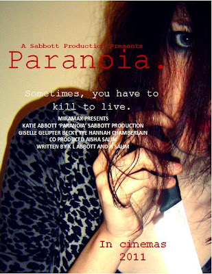
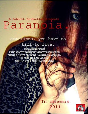


(With logo)
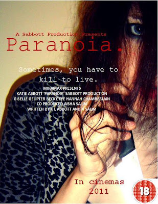

(with film certificate)

Film poster evaluation and analysis:

The messed hair flicking in all directions suggests that the personality of the person is 'all over the place' and that they may not have control over themselves. The eye gives the impression of being watched, as if she is watching you, as well as implying determination and unafraid of eye contact. It is as if she is looking directly at what she wants. The way she is holding the knife like a dagger suggests superiority over the 'victims'. The leopard print material suggests she is animistic and possesses animal qualities, which is supported by the fact her hand is in a claw shape. The shadow suggests that she is not alone, but could also represent her mind, that there is a shadow of her mind with her two personalities. The red font denotes danger, death and anger, but also love. These both contradict each other to give the impression that the character feels both completely different emotions. The font resembles a typewriting font, which gives the impression of an old fashioned element to the film. The full stop resembles a dead end, as if there is no way to get rid of the paranoia. Finally, the blank wall gives the impression that there is nowhere to run and could represent a psychiatric hospital wall.

Final draft: Even though this is a final draft, I am still unsure between this one or the previous draft. This is because it may appear too full of information for some people. Therefore, I am posting them both for people to make their own mind up. Having said that, I prefer the previous poster, as I think it looks more standard and professional.


We have included a billing block to make the poster look more professional and standard. It is also in a conventional font colour and size, which makes it look more realistic.

We have also added on names of the stars.

Another element we changed was the additional screen shots of the film.

We have included the tagline on the poster, which links to the trailer "Sometimes, you have to kill to live." This could make an audience associate the poster and trailer together instantly. It is used to draw an audience into wanting to watch the film.

The title is large, bold and so it is one of the first elements of the poster people see. They may associate the colours and images with the magazine front cover.

The main cover image is of Mindy holding a knife. The knife is eye catching because it shimmers with the light. This gives the murders an almost innocent look, especially as you cannot see any blood involved. It could reflect the title of the film 'Paranoia', as the audience may feel paranoid as to why there is there no blood on show. Our film is not a slasher movie and so we didn't want to illustrate a lot of gore, as it may distract the audience from the fact that they are looking at a film poster for a psychological horror. However, the red font suggests gore, subtley.

Wednesday, 24 November 2010

Subsidiary Audience Feedback


We asked our teacher to record her thoughts and feedback on our first film poster, so we knew how to make improvements for our final piece.

Final piece: Magazine front cover

After talking to friends about how to improve our magazine front cover, as it appeared to be our weakest point, they told us to put more information and tag lines onto the cover to make it appear compact, with more information inside than the draft. Also, another criticism was to improve the layout of the cover, as well as adding on typical magazine front cover conventions, for example the strap lines and other images. As well as this, we decided to cut down on the amount of colours used, because along with the central cover image, it appeared too colourful and it was harder to be associated with the film poster. Therefore, it wouldn't have been as good at advertising 'Paranoia'. We also changed the title from 'Total Flicks' to just 'Flicks', as a few people told me it might stand out more to a reader.


The unique selling point illustrated on the front cover is that 'Flicks' is an exclusive magazine.