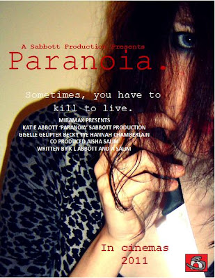

(With logo)

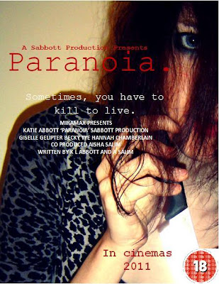
(with film certificate)
Film poster evaluation and analysis:
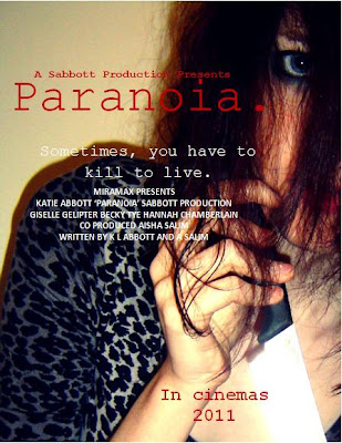
The messed hair flicking in all directions suggests that the personality of the person is 'all over the place' and that they may not have control over themselves. The eye gives the impression of being watched, as if she is watching you, as well as implying determination and unafraid of eye contact. It is as if she is looking directly at what she wants. The way she is holding the knife like a dagger suggests superiority over the 'victims'. The leopard print material suggests she is animistic and possesses animal qualities, which is supported by the fact her hand is in a claw shape. The shadow suggests that she is not alone, but could also represent her mind, that there is a shadow of her mind with her two personalities. The red font denotes danger, death and anger, but also love. These both contradict each other to give the impression that the character feels both completely different emotions. The font resembles a typewriting font, which gives the impression of an old fashioned element to the film. The full stop resembles a dead end, as if there is no way to get rid of the paranoia. Finally, the blank wall gives the impression that there is nowhere to run and could represent a psychiatric hospital wall.
Final draft: Even though this is a final draft, I am still unsure between this one or the previous draft. This is because it may appear too full of information for some people. Therefore, I am posting them both for people to make their own mind up. Having said that, I prefer the previous poster, as I think it looks more standard and professional.

We have included a billing block to make the poster look more professional and standard. It is also in a conventional font colour and size, which makes it look more realistic.
We have also added on names of the stars.
Another element we changed was the additional screen shots of the film.
We have included the tagline on the poster, which links to the trailer "Sometimes, you have to kill to live." This could make an audience associate the poster and trailer together instantly. It is used to draw an audience into wanting to watch the film.
The title is large, bold and so it is one of the first elements of the poster people see. They may associate the colours and images with the magazine front cover.
The main cover image is of Mindy holding a knife. The knife is eye catching because it shimmers with the light. This gives the murders an almost innocent look, especially as you cannot see any blood involved. It could reflect the title of the film 'Paranoia', as the audience may feel paranoid as to why there is there no blood on show. Our film is not a slasher movie and so we didn't want to illustrate a lot of gore, as it may distract the audience from the fact that they are looking at a film poster for a psychological horror. However, the red font suggests gore, subtley.