Monday, 29 November 2010
Weather forecast week commencing 29/11/10
As we are due to film our final sequences to finish off our trailer this week and that some scenes are to be filmed outside, we researched into the weather forecast, so we know what days to film on. If the weather forecast changes on the day of filming, we have made a contingency plan to adjust to this, for instance some scenes that were meant to be filmed outside will be adapted to the inside.
Sunday, 28 November 2010
Editing techniques and effects of horror films
Horror films have always been extremely popular and have generated huge amounts of profit for the worldwide film industry. For example, Halloween, Friday the 13th, Scream and Alien have been big blockbusters and have spanned into sequels and more. Yet, whilst these films often relied on a big budget, gore and successful actors to captivate the viewers, there are many other techniques which we can incorporate into our trailer, in order to make it more scary and full of suspense, since we do not have the budget to make a typical Hollywood standard trailer, as we are only two A-level media students!
· Let The Audience See What The Rest Of The Cast Cannot
A common, but effective, technique that is used in horror is the one in which only the audience and the subject (the ‘killer’) know what is happening except for the rest of the cast. Therefore, shots of the subject sneaking up on their victim who is oblivious to the situation often creates a scary, intense moment of the film. This is achieved to its greatest effect by filming over the shoulder of the killer, known as ‘Over the Shoulder’ shot.
· The Killer’s Eye View
Katie and I think that probably the best example of this can be seen in the film Jaws, where the audience can see a shot of the swimmer’s legs from underneath the surface of the water paddling. This ‘Point of View’ shot and very tense scene shows us the shark’s perspective of the swimmer, putting us in the world of the killer and creating discomfort to the audience.
· The Unexpected
All horror films rely on the unexpected to scare the audience at specific moments of the plot. For example in the film Jaws, the decapitated head floating out into the water is a prime example where most of viewers watching the scene would have experienced an unpleasant shock. An alternative take on this technique is a focus of the camera on a particular area, such as a curtain next to an open window, which zooms in slowly. This scary technique creates the illusion of you expecting the killer to be behind the curtain so when it’s someone else, the viewer is still expected to be shocked. It also serves to indicate that the killer’s still around somewhere.
Horror films use so many special effects these days in order to thrill the audiences. Nevertheless, the main techniques we have studied still have an amazing ability to be able to scare audiences and are simple to incorporate into films- or in our case trailer- without needing many effects or a big budget. For example, by also adding scary non-diegetic sound to our trailer, it can heighten the intensity considerably and filming at night also adds dramatic effect. Therefore by trying these basic techniques, it will give us a useful start in the creative process of filming our psychological horror trailer.
Saturday, 27 November 2010
Distribution
The distributors of a film have to promote the film through the release in mediums including print, digital, celluloid prints and more recently with 3D. Their job is to market and publicise the film. There are some considerations to think about when distributing a film. If there is another major film released on the same week, it could mean that most of the week’s sales for film go to the other new release, so to ensure that the public take the opportunity to see our new release, we have to make sure it is released on a quiet week. This is especially true if another psychological horror is released at the same time. The trouble with distributing Paranoia is that it has an unknown cast and stars are used as a film’s unique selling point (USP) and help to sell the film. Even so, the cast of our film can still attend interviews and chat shows, as, even though they are unknowns, this can still promote the film. Another way of creating publicity is to win awards, because it sometimes promotes the film through television, which is being watched by millions of viewers, who then discuss the film by word of mouth and spread the ideas. Another way of promoting the film is through print, for instance in newspapers, magazine articles, posters on bus shelters, buses, billboards and through digital promotions like television adverts and trailers, although our film will have fewer promotions because of the low budget.
Types of promotion:
Poster on a bus shelter:
Poster on a bus i.e. 'The Hangover'
Types of promotion:
Poster on a bus shelter:
Poster on a bus i.e. 'The Hangover'
Screenshots of our media influences
The films in which these screenshots are from have influenced us in terms of camera shots, editing and mise en scene. We have watched the trailers of these influences to create a bank of screenshots that stand out in particular. We might base our camera shots on a few of these.
Screenshots and images we used to reflect these influences:
This shot is similar to the staircase shot in 'The Sixth Sense'. (Shot 3)
This dark backward high angle shot is similar to the shot in 'The Shining'. (Shot 11)
This low angle shot is similar to the shot in '1408'. (Shot 7).
This show is similar to shot 10.
Thursday, 25 November 2010
Final piece of film poster
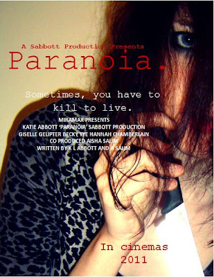
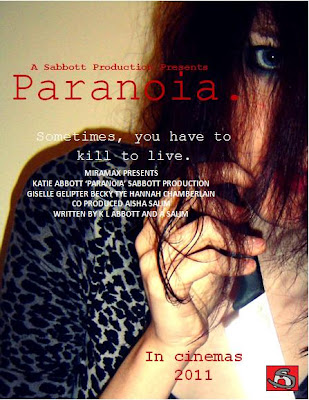
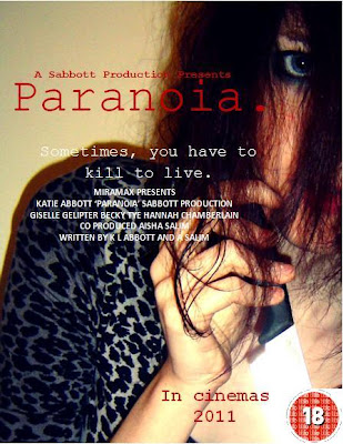
We have decided to use our audience feedback on our film poster to our advantage and improve it even more. For our final piece, we have decided to add the BBFC rating, so that it can be distributed in appropriate areas and therefore target the right audience. We also decided to make the font bigger and more contrasting to the image. Another adjustment we have made the the poster is the addition of our production logo. After looking at a series of posters, we came to the conclusion that the posters with reviews on rather rather than without caused more people to want to see the whole film, despite the fact that it was the same poster, just without the review added on. We decided the reviewer should be from a magazine, like Sight and Sound (an indie film magazine). This one may be more suitable than a magazine like Empire, because our film is a low budget, unknown casted film. These types of films feature heavily in independent magazine. Therefore, we have decided to use Sight and Sound magazine for a review because people who read the target audience of the magazine are likely to be similar to our target audience. We have also increased the font size of the billing block. We may also decide to add some screenshots onto the poster because this could enhance the sense of a narrative and illustrates the characters.
(With logo)
(with film certificate)
Film poster evaluation and analysis:
The messed hair flicking in all directions suggests that the personality of the person is 'all over the place' and that they may not have control over themselves. The eye gives the impression of being watched, as if she is watching you, as well as implying determination and unafraid of eye contact. It is as if she is looking directly at what she wants. The way she is holding the knife like a dagger suggests superiority over the 'victims'. The leopard print material suggests she is animistic and possesses animal qualities, which is supported by the fact her hand is in a claw shape. The shadow suggests that she is not alone, but could also represent her mind, that there is a shadow of her mind with her two personalities. The red font denotes danger, death and anger, but also love. These both contradict each other to give the impression that the character feels both completely different emotions. The font resembles a typewriting font, which gives the impression of an old fashioned element to the film. The full stop resembles a dead end, as if there is no way to get rid of the paranoia. Finally, the blank wall gives the impression that there is nowhere to run and could represent a psychiatric hospital wall.
Final draft: Even though this is a final draft, I am still unsure between this one or the previous draft. This is because it may appear too full of information for some people. Therefore, I am posting them both for people to make their own mind up. Having said that, I prefer the previous poster, as I think it looks more standard and professional.
We have included a billing block to make the poster look more professional and standard. It is also in a conventional font colour and size, which makes it look more realistic.
We have also added on names of the stars.
Another element we changed was the additional screen shots of the film.
We have included the tagline on the poster, which links to the trailer "Sometimes, you have to kill to live." This could make an audience associate the poster and trailer together instantly. It is used to draw an audience into wanting to watch the film.
The title is large, bold and so it is one of the first elements of the poster people see. They may associate the colours and images with the magazine front cover.
The main cover image is of Mindy holding a knife. The knife is eye catching because it shimmers with the light. This gives the murders an almost innocent look, especially as you cannot see any blood involved. It could reflect the title of the film 'Paranoia', as the audience may feel paranoid as to why there is there no blood on show. Our film is not a slasher movie and so we didn't want to illustrate a lot of gore, as it may distract the audience from the fact that they are looking at a film poster for a psychological horror. However, the red font suggests gore, subtley.
Wednesday, 24 November 2010
Subsidiary Audience Feedback
We asked our teacher to record her thoughts and feedback on our first film poster, so we knew how to make improvements for our final piece.
Final piece: Magazine front cover
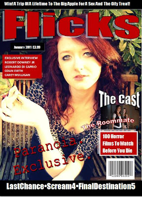
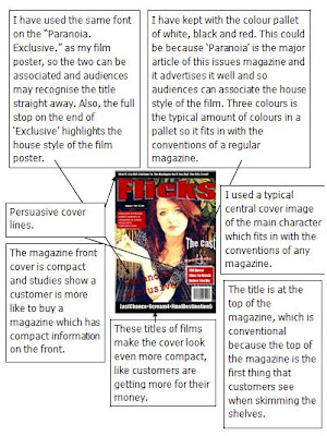
After talking to friends about how to improve our magazine front cover, as it appeared to be our weakest point, they told us to put more information and tag lines onto the cover to make it appear compact, with more information inside than the draft. Also, another criticism was to improve the layout of the cover, as well as adding on typical magazine front cover conventions, for example the strap lines and other images. As well as this, we decided to cut down on the amount of colours used, because along with the central cover image, it appeared too colourful and it was harder to be associated with the film poster. Therefore, it wouldn't have been as good at advertising 'Paranoia'. We also changed the title from 'Total Flicks' to just 'Flicks', as a few people told me it might stand out more to a reader.
The unique selling point illustrated on the front cover is that 'Flicks' is an exclusive magazine.
Tuesday, 23 November 2010
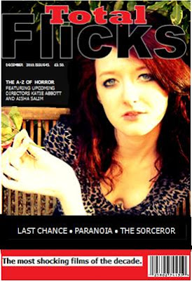
Magazine front cover for 'Total flicks' (draft)
'Flicks' first draft
Monday, 22 November 2010
Edited Film Poster for 'Paranoia' (draft)
Sunday, 21 November 2010
Sabbott production logo
Saturday, 20 November 2010
The use of a handheld camera
Many low budget films use the handheld camera, as it is much cheaper to shoot than using conventional shots like panning and tracking shots. However, using a handheld camera technique decreases the smoothness of the shots.
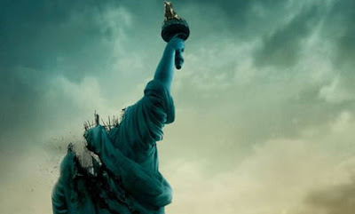
Recently, this technique has been used in the horror genre, in films such as Paranormal Activity, Cloverfield and REC. Most of the time, directors carry out handheld shooting for an aesthetical purpose as it denotes realism and can involve the audience in the film, making it more tense for the audience as they may feel a part of the film. It is useful for horror film directors to increasingly use this technique, because as it involves the viewers, it many also increase the 'scare factor'.
An example of a horror film, which predominantely used a handheld camera technique successfully was Paranormal Activity, which was produced withy $15,000 and then generated a gross revenue of $193,355,800. This is an incredible revenue for a film as cheaply produced as this. The advantage of a handheld camera is, if they're used cleverly, the film can generate massess of revenue. We have decided to include some handheld scenes in our trailer to aesthetically increase the look of our film tom make it appear more gritty.
Friday, 19 November 2010
How the horror genre represents women including the theory of the final girl
We researched into typical horror conventions and found the theory of the final girl which we have used in our treatment.
The Final Girl Theory refers to the final girl in most horror films who is the last woman or girl alive to face up to the killer, and specifically the only one left to tell the story.
The final girl has been observed in dozens of films, including A Nightmare on Elm Street and The Texas Chainsaw Massacre.
The term was created by C. Clover from her book Men, Women and Chainsaws: Gender in the Modern Horror Film. Clover suggests that in these films, the viewer begins by sharing the perspective of the killer, but experiences a shift in identification to the final girl partway through the film.
We have followed this convention, as we thought it would be best suited to the theme of our trailer. We have discussed the narrative of our trailer and concluded that it would be most effective for the audience to first see the story through the killer (Mindy) and later shift that perspective into our final girl (Riley).
Before we had agreed to this, we had to uncover some basic facts about who our final girl might be, and what impact will she have in our horror trailer, in order for it to be interesting enough for the audience to want to see.
We had named our final girl Riley, as it seemed best suited for a horror trailer than our first choice, Adelaide, which seemed too romantic to fit into the horror theme. This supports Carol’s notion that most final girls have a unisex name, such as Taylor or Alex.
According to clover, the final girl is typically sexually unavailable or virginal, mainly avoiding the danger the other victims go through. We had discussed that Riley will be portrayed as innocent, and at first borderline ignorant of anything around her. This also links to how she is unaware of her boyfriend Reuben cheating on her with her best friend Stella, until Mindy discovers this herself.
However, we had discussed that later on the trailer, Riley would become hardened by her boyfriends deception and begin mature in order to uncover what danger is causing the killings. Carol states that the final girl is the ‘investigating consciousness’ of the film, moving the narrative forward and as such she displays intelligence, curiosity and vigilance.
Clover also argues that for a film to be successful, the final girl is masculinised. It is also necessary for this surviving character to be female, because she must experience dismal horror, and many viewers would reject a film that showed abject terror on the part of a male. Since our targeted audience is a mass hybrid of young adults, we had concluded that the final girl would be one of the main conventions we will apply to our trailer, as we want the audience to feel connected to our character and sympathise with her circumstances.
Clover discusses that the terror has a purpose, in that the female is ‘purified’ if she survives, of undesirable characteristics, such as relentless pursuit of pleasure in her own right.
We had concluded that throughout the end of the trailer, Riley loses her ignorance and egotistic personality as she comes into terms that things are not what they seem, and that her popularity, relationships and personal view of her world are far from what she assumed it to be.
Women are generally stereotyped in film, as domesticated and sexual, defined through men rather than defining themselves. In the horror genre, there are cases where this is challenged and other cases where this is reinforced. An example of where it is reinforced is in vampire films, where women are sexualised through the seductive bite of the vampire. Another point is that the way women are killed by the vampires demonstrates the power that men have over women and makes women seem helpless. Another example in horror films is when women go to 'check out' what is causing a noise they have just heard- ultimately leading to their death.
Thursday, 18 November 2010
Final Destination 3 Film Poster Analysis
· The poster of Final Destination 3 poster uses a rollercoaster as the main basis of the horror, something generally regarded as safe.
· The colour pallet of the poster uses dark and monotone colours such as blood red for the rollercoaster.
· There is a subtle hint of foreshadowing in the poster, as some passengers at the back have skulls for faces, which implies the theme of death and horror.
· The passengers are upside down on the rollercoaster, which is an unnatural position to be seen in and would make the audience uncomfortable to see.
· The use of the pun “This ride will be the death of you” underlies the notion that these passengers are to die from riding this rollercoaster.
· The use of the second person pronoun “you” involves the audience and makes them feel part of the passengers from the poster, making the audience feel more uncomforted at the thought of dying from a rollercoaster ride.
Conventions from this poster we will be using in our poster:
- Billing block
- Eye catching title
- Scary central image
- Tag line
Wednesday, 17 November 2010
The Descent Film Poster Analysis
· The poster is mainly in monochrome as the use of black upon white is a powerful statement of being trapped within utter darkness with little light.
· This links to the plot of the movie, making the poster relevant and gives a glimpse of what the movie offers.
· The font is in white against the black background, which makes it powerful and eye catching. The simplicity of the poster leaves a lot to the imagination of the audience, making them want to watch the film to find out what it is about.
· The tagline is also in white and is further apart from any other writing, making it easier to spot. It also plays a pun within the word “deepest fear” as the underlying meaning of “deep” links to the women being trapped deep underground, and the word “fear” relates to the horrors that go on in the film.
· The poster review reinforces how good the film is, and makes the targeted audience want to watch the film and find out for themselves how good it might be.
· The face of a horrified dirty and bleeding woman is a powerful display which reinforces the horror that will happen to her. This makes creates the first enigma code as the audience will want to watch the film to find out what had made her turn into that state.
· In the top left corner of the poster, the light displays an image of a skull-like face, which audiences might find disturbing as it is quite an unnatural and unsettling to think about what it might be.
· The use of the light to create the monster-like face, along with the scared woman, creates a sense of foreboding, as the audience might realise that this could cause her death and horror within the film. Therefore making the audience want to watch and find out what will happen to her.
Conventions we want to take from this poster to use on our own poster:
- Review
- Production company i.e. 'A Sabbott Production Presents'.
- Dark colour palette
- Eye catching title
- Billing block
Tuesday, 16 November 2010
Male Lead
Due to unforeseen circumstances, we had to change our male lead, as he was no longer available to play the part. This was a huge knock back because we spent a whole day filming with him and now have to find a solution to solve the issue. We are now trying to find someone else to play the lead.
These are our rough cuts with this actor.
Monday, 15 November 2010
Schedule for week commencing 15th November 2010
This week we aim to complete:
- Upload rough cuts
- Upload draft subsidiary tasks and begin the final piece
- Upload the final piece
- Begin evaluation
- Upload rough cuts
- Upload draft subsidiary tasks and begin the final piece
- Upload the final piece
- Begin evaluation
Saturday, 13 November 2010
Sight and Sound magazine front cover analysis
The sans serif font and orange in the title strap denotes enthusiasm, happiness and purity, which contradicts the central cover image of the woman with a bloody knife. We did not want to use this on our magazine, because it is not subtle enough in what it is promoting. However, we wanted to study the magazine, because it is an indie magazine and our project is low budget. The other element we noticed about this magazine front cover was that it was not crowded with information like Gorezone. Therefore, we wanted to have just the right amount of information on our front cover, so that it is not too crowded, but not too simplistic.
Gorezone magazine front cover analysis
The red and black in the eyecatching title denotes blood and death, but love at the same time. We want to take this element of this magazine front cover for our own magazine front cover. The jagged edges of the title denote sharp or phalic objects, such as murder weapons. This is another element we want to include on our cover. This front cover has definitely stuck to Laura Mulvey's theory of the male gaze, with the woman on the front. With this convention in mind, we want to have a central cover image on our magazine front cover to establish the theory of the male gaze on our magazine (usually the women are revealing, but at the same time covered up, which is commonly used to help sell a magazine. We found after looking at other magazines in shops, the title covers up some of the central cover image, which we want to adopt onto our cover. The fact that the central cover image is a character from the film which will be promoted in the magazine helps to advertise 'Paranoia'.
Friday, 12 November 2010
Mirrors Film Poster
The cracked mirror image of the film poster and the fact that the source of the crack appears to be in the man's eye suggest that what he is seeing is distorted or 'cracked'. The close up camera shot illustrates his emotion even more.
Conventions we want to take from this poster for our own poster:
- Simple colour pallet
- Main cover image
- Billing block
- Date of release
- Tag line
Wednesday, 10 November 2010
Fatal Attraction Film Poster
The torn look of the poster suggests there is a broken, torn relationship between the two people juxtaposing the original image. The red could represent anger and/or danger.
The swirly font could normally suggest happiness and calmness, however, the use of the red font juxtaposes this original connotation.
Conventions we want to take from this film poster for our own:
- Red colouring (danger, death, love)
- Tag line
- Eye catching title
- Actors/actresses names at top of poster
- Production company
Tuesday, 9 November 2010
The Uninvited Film Poster
The fact that you cannot see a face suggests mystery and uncertainty in who it actually is. The child like font of the title gives the impression that there is a sense of innocence in the film. The colourless dark greys and blacks of the poster denotes evil and death.
The conventions we want to take from this poster for our own film poster:
- Tag line
- Billing block
- Date of release
- Dark colours
- Large eye catching title
Sunday, 7 November 2010
Single White Female Film Poster
The main woman (Bridget Fonda) is in the foreground, which could convey that she is dominant in her own mind. The close up of her illustrates she is emotionless. In the background, behind the door, the other girl is looking at her in a sinister way. The fact that she can see her (Bridget) but Bridget cannot see her suggests she is the knowledge of something secret. The fact that she is looking into the foreground suggests she wants to be her and that she wants to be the centre of attention. The title is portrayed in a ripped newspaper effect, which is sinister because the word 'trustworthy' can be seen, quite clearly juxtaposing the darkness of the film.
The conventions we will take from this poster for our own poster:
- Tagline
- Eye catching title
- Names of the main cast
- Image of the villain
- Billing block
- Dark, simple colour pallet
Saturday, 6 November 2010
Storyboards edited
These are our final storyboards for the final piece.
Shot 1: Establishing long shot of school entrance
Shot 2: Close up of Mindy and Mrs Goodall
Shot 3: Long shot of Mindy walking through the doors
Shot 4: Long shot of Mindy walking towards the camera
Shot 5: Pan of Reuben walking into the class
Shot 6: Pan of Reuben walking with Riley
Shot 7: Long shot of students sitting at desks, then finishes with slight zoom onto Mindy, who the girls think is laughing at nothing
Shot 8: Four shot of the girls talking. Reuben grabs the boxes and there is a pan of them walking away
Shot 9: Zoom of girls walking through school
Shot 10: Backward shot of the same girls walking. Reuben has 'appeared'
Shot 11: Long shot of Mindy reading
Shot 12: Shot of Mindy's hand. At this turning point of the trailer, she realises that Reuben isn't just interested in her. She gets jealous
Shot 13: High angle shot of someone walking into a dark cupboard
Shot 14: Close up shot of Riley's emotion
Shot 15: Close up of a sticky note, where Mindy has written Reuben's name down over and over- illustrates her obsession
Shot 16: Three shot of girls discussing the missing girl, Stella
Shot 17: Pan of Stella walking through a field
Shot 18: Midshot of the girls and Mindy
Shot 19: Ground shot of Stella getting up off the floor
Shot 20: Point of view (POV) tracking shot of Charley running
Shot 21: Midshot of Stella throwing up blood
Shot 22: Midshot of Stella, illustrating her emotion
Shot 23: Close up of Mindy
Shot 24: POV of Charley screaming
Shot 25: Midshot of Becky running into the toilets
Shot 26: Shot of two girls running
Shot 27: Shot of girl on the floor
Shot 28: POV tracking shot of Stella
Shot 29: Tracking shot
Shot 30: Long shot of Riley falling to the ground
Shot 31: Midshot of Stella falling to the ground
Shot 32: Close up of Riley tied up and struggling
Shot 33: High angle shot of Stella
Shot 34: Backwards midshot of Stella in the woods
Shot 35: Longshot of the woods
Shot 36: Panning shot of Mindy dragging the knife on a door
Shot 37: Close up shot of Stella on the grass
Shot 38: Midshot of Mindy looking down off a bridge
Shot 39: Long shot of Riley struggling on a roof
Shot 40: Two unknown characters running into a cupboard
Shot 41: Two unknown characters running- close up of their bodies
Shot 42: Long shot of Ellie and Rebecca tripping
Shot 43: Midshot of Mindy using her phone
Shot 44: Riley talking to Mrs Goodall about Heather
Shot 45: Midshot of Becky holding the door to stop someone from coming in
Shot 46: Unknown characters running past in a midshot
Shot 47: High angle POV shot of Riley on the floor
Shot 48: Close up of a door opening
Shot 49: POV tracking close up of Stella
Shot 50: Midshot of Mindy behind a tree
Shot 51: Close up of Riley running
Shot 52: Close up of fur coat and knife dropped onto it
Shot 53: Close up of Becky closing a door
Shot 54: Midshot of Mindy crawling along the floor with a knife
Shot 55: Close up of Charley on the floor
Shot 56: Low angle shot of Mindy walking away
Shot 57: Another girl screams
Shot 58: Long shot of Riley running away
Shot 59: Charley is on the floor- Mindy strokes her hair
Shot 60: Backward impact shot of someone being grabbed with force
Friday, 5 November 2010
Camera angles, movements and shots
We have decided to incorporate many camera movements into our trailer to create different effects.
The speed of the movement affects the impression portrayed to the audience. If a camera moves fast and shakes, it can convey tension, drama and a sense of urgency. This relates to our trailer because we will be shooting many fast paced montage clips to illustrate the drama and thrill- clips such as chases and falls. If a camera moves slowly, this can convey a calm atmosphere. However, we are going to use this to juxtapose the plot with a slow camera movement and a horrific atmosphere. We have already used a tracking shot to really illustrate how close the murderer is to one of the friends as she is being chased down the pavement.
To convey the sense of importance of the main character, Mindy, we want to use a 360degree panning shot. This will illustrate just how much she thinks is the centre of attention. This also relates to the character's emotions because she wants to feel like the centre of attention to Reuben.
As there is a clip of Mindy pushing a girl off a bridge, we have decided to capture this in a tilt shot to really illustrate the height of the bridge and how far it is to fall. This will also be used when the character has fallen to the ground and there is a low angle shot to exemplify how important and in control Mindy really is.
Shots
Thursday, 4 November 2010
Budgeting
Even though, we are only producing a trailer with the resources we have around us, there have been several occassions where we need to make some purchases i.e. makeup and ingredients to make fake blood etc. in order to continue with our filming. Therefore, we have had to budget to afford these purchases. This is sometimes described as 'below the line' budgeting, because we have budgeted our money for production elements only. We have also saved a small amount of money for contingency, as we may need to quickly purchase other small unforseen costs.
Subscribe to:
Posts (Atom)