Friday, 17 December 2010

What have you learnt from the audience feedback?

Aisha and I decided to gather a group of 10 students to sit and participate in an audience feedback viewing session, where they watched the trailer and filled in a questionnaire on the positives and negatives and how to improve. There were also questions on initial reactions and whether they would like to watch the whole film. Generally, people were positive about the trailer, but there were some negative points, which we took as constructive criticism, in order to improve even more.

During the viewing of the first draft, the audience were not sure on the red titles, as they were not able to read what it was saying. We learnt that even if the titles do not look that interesting, it is fine as long as people can read them, so we eventually went for white font on a black background. At first, some of the audience were confused, but after we added voiceover bridges, they understood what was going on. If the audience understand the main plot, they are more likely to want to go and see the whole film.

The critics liked the music, as they felt at each point of the trailer, the music conveyed the emotions of the characters.

At the beginning of the trailer, Mindy dials 999 to speak to the police about her killings. At this point it is not clear why she is dialling this number but it conveys a sense of mystery, which in the audience, that she clearly gave to the other characters. However, at first the phone call was long and quite revealing i.e. Mindy claims 'I just killed my friend', we cut it down to only a few sentences. This went down well with the audience because it enhanced the mystery even more.

The audience liked the final shot because the music and shot combined scared them and made them jump and it left them feeling nervous, but wanting to see the rest of the film.

A few people criticised that they weren't sure who all the people were. However, a trailer is not supposed to give everything away and so they realised that in the actual film, the characters personalities would be built up.

Aisha and I made an informed decision regarding our choice of research methods, in order to gain our audience feedback. Firstly, we made a visual documentary on people's views on horror films. We also researched in the form of questionnaires.

These methods work to our advantage, as the methods we had concluded to use were easily accessible. Consequently we could also use the information gained such as the audio recording feedback from Garageband, and incorporate it into our rough cut, therefore creating an audio commentary feedback. This would be a more communicative method of analysis than just writing the information into our blogs. Another advantage to our choice of research methods is that we could also receive immediate feedback, which in turn would make the process of improving our trailer much quicker and convenient.
The choice of our target age range enabled us to easy access of our target audience as we had our peer groups and friends, as well as teachers and relatives, to provide views of our rough cut and make relevant critical comments to our trailer.
Nevertheless, there are some factors that might hinder the validity of our research gained. For example, interviewer desirability bias may occur when we carry out interviews or offer questionnaires to our target audience, as they may feel pressured to give the “correct” answer that we might want to hear, instead of giving constructive criticisms. This could be evident in group interviews, as a person might be prone to giving the same response as the other interviewees.
Another problem is time keeping, as our target audience might of felt rushed for time while completing our analysis. However, we had resolved this problem by briefing them of what our research is about and telling them that they could take their time answering the questions.

Our questionnaire
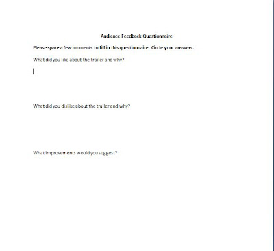


Below is a link to my Aisha's blog of a film of our audience, who took part in filling in the questionnaire.

Aisha Salim Media A2:
Thursday, 16 December 2010

How did you use new media technologies in the construction and research, planning and evaluation stages?

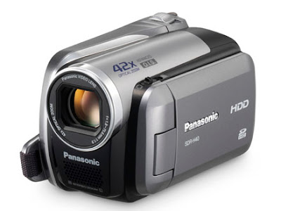
During the construction, research, planning and evaluation stages of our project, we used Mac computers, scanners, HD Panasonic camcorders, garage band, photo editing websites, digital cameras, imovie and websites such as facebook, blogger, youtube and the Internet movie database.

Although it took a a while to get used to the Apple Macs, we managed to quickly learn how to use each piece of software and take advantage of all different tools and things that can be done on a Mac rather than a PC. It was easier to store files on the MACs and it was quicker to access software and the Internet.

The main programme we used to edit our trailer with was imovie. We used our previous skills from AS to use various editing techniques, for instance, slow motion, fade in/out, creating montages, importing clips and sound from the camera, reducing unwanted background sounds, importing music and sound effects and enhancing the light and saturation.

Blogging meant that it was accessible for both of us wherever we were in school or out of school to be able to store work and make posts. The only downside was that we couldn't upload all of our rough cuts because there were so many and it wouldn't upload such a large file. The good side is that its not all done on paper and therefore easy to lose, but it is always there and easily edited. Also, being able to incoroporate videos, images and sounds to support our work. It was also a way for Aisha and I to leave messages to eachother, in order to make sure everything was completed and uploaded. Other students commented on our posts as well and comments were made from the teachers to inform us on what could be improved. There is also a chance to put links to other websites into the posts to support the work.

We used a scanner to upload our storyboards and moodboards. This meant we were able to create a storyboard on paper, rather than on the computer which might have taken much longer. It was a fast way of getting it onto our blogs.

We used the internet movie database to research on trailers and other horror films, in elements such as production companies, directors, distributors, taglines, genres and casting. Although we did much of our research online, I did also read books on horror films, which gives a slightly different angle, but when the Internet was down in school, instead of doing nothing, we took the opportunity to visit the library for further research. We also read film magazines and newspapers for research, however, it is far more time consuming because it takes longer to search for the information you want.

We used Facebook to message eachother on schedules and also and created photo albums in order to share images for editing etc. This meant we had easy access to our work.

We used Youtube for trailers and music to incorporate onto our blog.

To create and edit the images for our film poster and magazine front cover, we used a photo editing website, to airbrush, change the saturation, brighten, contrast and change the focus of the foreground and background. For the front cover of the magazine, I edited an image by cutting around it and placing it on a white background. We decided not to go ahead and use it as our final piece, however.

We used garageband to produce our music. We used current immediate music pieces and cut and pasted parts of each, along with our own additional sound bridges to enhance the emotion in each part of the trailer. We also found other already made sound bridges and embedded them into the trailer from Youtube. Garageband was useful to be able to mix the different pieces, rather than making our own song in real life. It would have been time consuming to gather a band together to play a song.

The video camera (Panasonic HD), was simple to use and was enhanced with the use of a tripod.

We used digital cameras to take our location photos.


Wednesday, 15 December 2010

In what ways does your media product use, develop or challenge forms and conventions of real media products?

Usually in a psychological horror, there is no distinctive setting. I believe this is because one or more of the characters are mentally unstable and one setting provides stability, so the film needs to convey a sense of instability. We used various locations to film our trailer, including a school, a house, streets, gardens and near to a railway station.

We wanted to challenge the typical convention of a male killer because we felt it would be creepier if we had a female villain because women are associated more with kindness, innocence and not neccessarily with much power.

We used the typical weapon- the kitchen knife- in our trailer and on our poster. This is conventional to a horror film.

Another convention we stuck to was the idea of leaving it on a cliffhanger and then we actually came up with a twist that we planned to focus around, with subtle clues in the trailer, without actually giving anything away. In our film, the twist was that the main protagonist, Mindy, who was overwhelmed with jealousy over her new 'friend' Reuben, was in fact schizophrenic and Reuben was her other personality. This overwhelming jealousy and the fact he seemed to lead a better life than her, led her to attempt to kill him, only to end up killing herself.

We decided to develop, as well as challenge the convention of dark lighting , by using bright light in many scenes to juxtapose the horror of the murders. It could mirror Mindy's mind in the way that she might not see that there is anything wrong with what she is doing, so doesn't care if it is close in daylight because she is mentally unstable.

Another convention of a horror film is the point of view (POV) shot sometimes used to convey a sense of urgency and intimacy for the audience watching. We used a POV shot of a girl being chased by the killer and this creates a more tense effect as to whether the killer will catch up with the girl. This clip in the trailer was also challenged with the use of a handheld camera. The audience said it made them feel more involved and that it was more realistic, creating a suspenseful effect.

Tracking shots are common in horror films because they reinforce the sense of immediacy and urgency and therefore help to increase the scare factor.

One of the shots used in our trailer which is conventional to horror films is the extreme close up of someone's face, enunciating their eyes. This causes the audience to identify with the dead girl and feel sorry for her.

We decided to go against the traditional clothing in a horror film. Normally, the killer would wear casual clothes, but we decided we wanted her clothes to represent her character, so she always wore an item of clothing representing her to be a bit of an animal e.g. a large wild cat. They are usually conveyed to be passionate, dangerous and mighty. We wanted this to be reflected in our trailer, in that Mindy is passionate about Reuben, but this can lead her to become very dangerous.

Another convention that we wanted to follow in our trailer was the a jumpy ending to reinforce the idea that there may be more jumpy bits in the actual film. Our very last sequence was short, but made our audiences jump. This may leave them feeling that it may be worth watching if they get scared and may especially appeal to niche audiences, who like being scared.

Tuesday, 14 December 2010

How effective is the combination of your main product and subsidiary tasks?

Both the trailer and the print promotions are successful together. They compliment each other to promote our film. Two of the shots in the montage are of the main character, Mindy, reaching out to grab a knife and dragging the knife across the floor in an outfit conveying her animistic side. The film poster uses the weapon image to compliment the scenes of the film and then used in the trailer. The magazine front cover somewhat juxtaposes the trailer and film poster. Although she is still wearing the top, giving her an animistic quality, she is holding a pink rose. Pink roses can signify gentleness, sweetness, joy and admiration, which completely juxtaposes the genre of the film. We wanted to create this effect because it creates a more sinister quality. This could be intriguing for a potential audience who, after discovering the film, could be shocked at the genre. This may help to bring up sales. The continuous use of the colour red throughout- in the trailer and on the film poster and the magazine front cover- give an impression of danger and death, but also of love. The use of eye contact on the magazine front cover of the film poster is a deliberate move because we want to make the audience feel uneasy. Since the film is about a girl who kills many people, it is as if the protagonist is looking directly at the reader, like 'they're next'.

It is important that the combination of all the tasks are effective together because they are distributed at the same time. The distributor promotes and publicises the film and under this role has to promote with film magazines, trailers and film posters. I am now going to explain how our film would be distributed, advertised and promoted. If the trailer, poster and magazine front cover are not effective as a combination, other films may end up with a larger gross profit, as there are so many horror films being made at the moment. An example of a recent popular horror film is 'Paranormal Activity'.

Monday, 13 December 2010

Does our trailer fit in with any narrative structures?

The narrative structures ensures that the story is defined and enables the audience to understand the messages within the film, which ensures the film has meaning throughout. This is also true of a trailer, even though much of the narrative should not be given away for the trailer to be considered successful.

One narrative structure was created by Tzvetan Todorov and involves five stages of a narrative. However, this can be broken down into three stages: a beginning (equilibrium), middle (disruption to the equilibrium by some crisis or action) and end (equilibrium reinstated). This is conventional narrative structure. My plot fits in with this structure as at the beginning the students in the school are just going about their daily business- everything is normal. Mindy joins the school and disrupts this with her jealousy and revenge. The reinstated equilibrium is not shown in the trailer, as we do not want to give too much away, but it is reinstated by her death and the fact she can no longer murder anyone.

The other two middle stages of Todorovs structure are:

Stage 3- The characters recognise the equilibrium has been disrupted and that there is a problem. This is true in our trailer because the character Riley realises that students are going missing.

Stage 4- The characters try to repair and change this disrupt and gain back the equilibrium that was disrupted. This means that obstacles need to be overcome to be able to regain equilibrium. This is where Riley tries to uncover what is really happening and tries to resolve it.

Even though we have been conventional with our narrative structure, once Riley discovers what is actually going on, the audience discover the twist, which is like an additional stage.

Another narrative structure was created by Vladimir Propp (dealing with characters/spheres of action). He stated that characters can be categorised into seven 'spheres of action'. These include: hero, villain, donor, helper, princess/prince, dispatcher and false hero. Films do not always use all of the 'spheres of action' and some characters can convey one or more of the spheres.

These 'spheres of action' (and which 'Paranoia' character would fit into the category:

Hero: The person/people who tries to restore the equilibrium = Riley

Villain: The person/people who's task is to disrupt the equilibrium = Mindy

Donor: The person/people who gives the hero something. This could include advice or significant information = this does not apply to our film

Helper: The person/people who aids the hero with their set task = at first, Heather, but later on, it does not apply

Princess (Prince): The person/people who need help, protecting and saving = Stella and Reuben (at the end)

Dispatcher: The person/people who send the hero(s) on their quest = this does not apply, because Riley decides for herself to solve the issue

Fasle Hero: The person/people who set out to undermine the hero's quest by pretending to aid them. Often unmasked at the end of the film = Mindy

Sunday, 12 December 2010

An error...


After watching our finished trailer through, we realised that we had left some faint and unnecessary text underneath 'Katie Abbott', which we previously didn't notice because it is so hard to see. We are quite happy that this is the only error we found. If we were to improve our piece even more it would be to remove this.

Saturday, 11 December 2010

Paranoia- edited 1


This is our re-edited piece of Paranoia, as we had some points to consider in order to make our trailer as effective as possible. Firstly we changed the title font and sizes, as it proved to be too short and undistinguishable for audiences to understand. Secondly we wanted to clearly establish who was the "popular girl and perfect boyfriend" as Mindy's voiceover states, so we added another shot of Riley and Reuben holding hands to show their relationship more to the audience. Lastly, we also added a surprise shot of Riley investigating an abandoned place, before being violently grabbed by somebody; this seemed like an effective enigma code as audiences would wonder if Riley survives, and would therefore want to watch more to find out what happens.

Monday, 6 December 2010

Rough cuts 1


We used some of the shots in this series of rough cuts. However, we had to mix the sequences around because trailer's are not always in chronological order of when the sequences occur in the film. Also, we want to change the music (it needs to be extended), titles, production and distribution logos, as well as the voice-over.

Friday, 3 December 2010

Improvements

Once the final piece is uploaded we are going to undertake various ways of gaining audience feedback in order to improve our work even more. (see evaluation)

However, I looked at our pieces and our blog as a whole and pondered over some ways we could improve it even more.

Rough cuts


Below are links to more of our rough cuts.

Aisha Salim Media A2: More rough cuts of trailer
Aisha Salim Media A2: Rough cuts of our trailer
Aisha Salim Media A2: Rough cuts of our filming so far!:
Aisha Salim Media A2: First filming

Wednesday, 1 December 2010

Last minute edits

We are just trying to pull together the editing in order to make improvements according to the audience feedback. We have also decided to alter our soundtrack in order to fit with the pace of our jump cuts. Another improvement is to include rating cards and production/distribution logos.

Monday, 29 November 2010

Weather forecast week commencing 29/11/10


As we are due to film our final sequences to finish off our trailer this week and that some scenes are to be filmed outside, we researched into the weather forecast, so we know what days to film on. If the weather forecast changes on the day of filming, we have made a contingency plan to adjust to this, for instance some scenes that were meant to be filmed outside will be adapted to the inside.

Sunday, 28 November 2010

Editing techniques and effects of horror films

Horror films have always been extremely popular and have generated huge amounts of profit for the worldwide film industry. For example, Halloween, Friday the 13th, Scream and Alien have been big blockbusters and have spanned into sequels and more. Yet, whilst these films often relied on a big budget, gore and successful actors to captivate the viewers, there are many other techniques which we can incorporate into our trailer, in order to make it more scary and full of suspense, since we do not have the budget to make a typical Hollywood standard trailer, as we are only two A-level media students!

· Let The Audience See What The Rest Of The Cast Cannot
A common, but effective, technique that is used in horror is the one in which only the audience and the subject (the ‘killer’) know what is happening except for the rest of the cast. Therefore, shots of the subject sneaking up on their victim who is oblivious to the situation often creates a scary, intense moment of the film. This is achieved to its greatest effect by filming over the shoulder of the killer, known as ‘Over the Shoulder’ shot.

· The Killer’s Eye View
Katie and I think that probably the best example of this can be seen in the film Jaws, where the audience can see a shot of the swimmer’s legs from underneath the surface of the water paddling. This ‘Point of View’ shot and very tense scene shows us the shark’s perspective of the swimmer, putting us in the world of the killer and creating discomfort to the audience.

· The Unexpected
All horror films rely on the unexpected to scare the audience at specific moments of the plot. For example in the film Jaws, the decapitated head floating out into the water is a prime example where most of viewers watching the scene would have experienced an unpleasant shock. An alternative take on this technique is a focus of the camera on a particular area, such as a curtain next to an open window, which zooms in slowly. This scary technique creates the illusion of you expecting the killer to be behind the curtain so when it’s someone else, the viewer is still expected to be shocked. It also serves to indicate that the killer’s still around somewhere.

Horror films use so many special effects these days in order to thrill the audiences. Nevertheless, the main techniques we have studied still have an amazing ability to be able to scare audiences and are simple to incorporate into films- or in our case trailer- without needing many effects or a big budget. For example, by also adding scary non-diegetic sound to our trailer, it can heighten the intensity considerably and filming at night also adds dramatic effect. Therefore by trying these basic techniques, it will give us a useful start in the creative process of filming our psychological horror trailer.

Saturday, 27 November 2010

Distribution

The distributors of a film have to promote the film through the release in mediums including print, digital, celluloid prints and more recently with 3D. Their job is to market and publicise the film. There are some considerations to think about when distributing a film. If there is another major film released on the same week, it could mean that most of the week’s sales for film go to the other new release, so to ensure that the public take the opportunity to see our new release, we have to make sure it is released on a quiet week. This is especially true if another psychological horror is released at the same time. The trouble with distributing Paranoia is that it has an unknown cast and stars are used as a film’s unique selling point (USP) and help to sell the film. Even so, the cast of our film can still attend interviews and chat shows, as, even though they are unknowns, this can still promote the film. Another way of creating publicity is to win awards, because it sometimes promotes the film through television, which is being watched by millions of viewers, who then discuss the film by word of mouth and spread the ideas. Another way of promoting the film is through print, for instance in newspapers, magazine articles, posters on bus shelters, buses, billboards and through digital promotions like television adverts and trailers, although our film will have fewer promotions because of the low budget.


Types of promotion:

Poster on a bus shelter:

Poster on a bus i.e. 'The Hangover'

Screenshots of our media influences

The films in which these screenshots are from have influenced us in terms of camera shots, editing and mise en scene. We have watched the trailers of these influences to create a bank of screenshots that stand out in particular. We might base our camera shots on a few of these.


Screenshots and images we used to reflect these influences:

This shot is similar to the staircase shot in 'The Sixth Sense'. (Shot 3)


This dark backward high angle shot is similar to the shot in 'The Shining'. (Shot 11)


This low angle shot is similar to the shot in '1408'. (Shot 7).


This show is similar to shot 10.

Thursday, 25 November 2010

Final piece of film poster

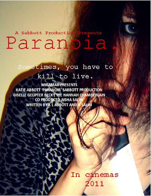
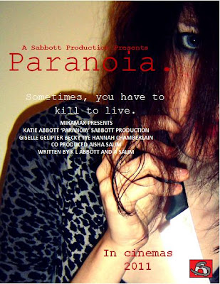
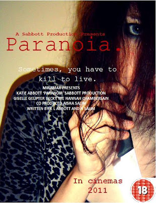
We have decided to use our audience feedback on our film poster to our advantage and improve it even more. For our final piece, we have decided to add the BBFC rating, so that it can be distributed in appropriate areas and therefore target the right audience. We also decided to make the font bigger and more contrasting to the image. Another adjustment we have made the the poster is the addition of our production logo. After looking at a series of posters, we came to the conclusion that the posters with reviews on rather rather than without caused more people to want to see the whole film, despite the fact that it was the same poster, just without the review added on. We decided the reviewer should be from a magazine, like Sight and Sound (an indie film magazine). This one may be more suitable than a magazine like Empire, because our film is a low budget, unknown casted film. These types of films feature heavily in independent magazine. Therefore, we have decided to use Sight and Sound magazine for a review because people who read the target audience of the magazine are likely to be similar to our target audience. We have also increased the font size of the billing block. We may also decide to add some screenshots onto the poster because this could enhance the sense of a narrative and illustrates the characters.


(With logo)


(with film certificate)

Film poster evaluation and analysis:

The messed hair flicking in all directions suggests that the personality of the person is 'all over the place' and that they may not have control over themselves. The eye gives the impression of being watched, as if she is watching you, as well as implying determination and unafraid of eye contact. It is as if she is looking directly at what she wants. The way she is holding the knife like a dagger suggests superiority over the 'victims'. The leopard print material suggests she is animistic and possesses animal qualities, which is supported by the fact her hand is in a claw shape. The shadow suggests that she is not alone, but could also represent her mind, that there is a shadow of her mind with her two personalities. The red font denotes danger, death and anger, but also love. These both contradict each other to give the impression that the character feels both completely different emotions. The font resembles a typewriting font, which gives the impression of an old fashioned element to the film. The full stop resembles a dead end, as if there is no way to get rid of the paranoia. Finally, the blank wall gives the impression that there is nowhere to run and could represent a psychiatric hospital wall.

Final draft: Even though this is a final draft, I am still unsure between this one or the previous draft. This is because it may appear too full of information for some people. Therefore, I am posting them both for people to make their own mind up. Having said that, I prefer the previous poster, as I think it looks more standard and professional.


We have included a billing block to make the poster look more professional and standard. It is also in a conventional font colour and size, which makes it look more realistic.

We have also added on names of the stars.

Another element we changed was the additional screen shots of the film.

We have included the tagline on the poster, which links to the trailer "Sometimes, you have to kill to live." This could make an audience associate the poster and trailer together instantly. It is used to draw an audience into wanting to watch the film.

The title is large, bold and so it is one of the first elements of the poster people see. They may associate the colours and images with the magazine front cover.

The main cover image is of Mindy holding a knife. The knife is eye catching because it shimmers with the light. This gives the murders an almost innocent look, especially as you cannot see any blood involved. It could reflect the title of the film 'Paranoia', as the audience may feel paranoid as to why there is there no blood on show. Our film is not a slasher movie and so we didn't want to illustrate a lot of gore, as it may distract the audience from the fact that they are looking at a film poster for a psychological horror. However, the red font suggests gore, subtley.

Wednesday, 24 November 2010

Subsidiary Audience Feedback


We asked our teacher to record her thoughts and feedback on our first film poster, so we knew how to make improvements for our final piece.

Final piece: Magazine front cover

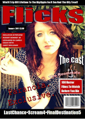
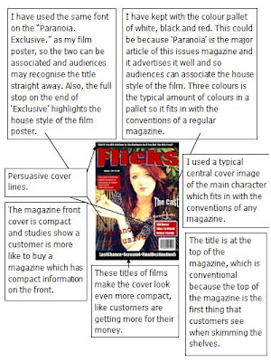
After talking to friends about how to improve our magazine front cover, as it appeared to be our weakest point, they told us to put more information and tag lines onto the cover to make it appear compact, with more information inside than the draft. Also, another criticism was to improve the layout of the cover, as well as adding on typical magazine front cover conventions, for example the strap lines and other images. As well as this, we decided to cut down on the amount of colours used, because along with the central cover image, it appeared too colourful and it was harder to be associated with the film poster. Therefore, it wouldn't have been as good at advertising 'Paranoia'. We also changed the title from 'Total Flicks' to just 'Flicks', as a few people told me it might stand out more to a reader.


The unique selling point illustrated on the front cover is that 'Flicks' is an exclusive magazine.

Tuesday, 23 November 2010

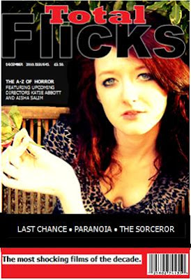
Magazine front cover for 'Total flicks' (draft)


Although we are happier with this draft than the first draft, we still want to make further improvements.

'Flicks' first draft


I just started to play around with some images, colours and fonts. I'm not keen on this, so I'm moving on to a different image and a different layout. However, I quite like this colour palette of white, red and black.

Monday, 22 November 2010

Edited Film Poster for 'Paranoia' (draft)


This is our first draft of our film poster. We will gain some audience feedback, in order to make improvements to it.

Sunday, 21 November 2010

Sabbott production logo


We might use this on our film poster, as we found that a convention of a film poster for some posters we researched into was to have the production company logo near to the billing block.

Saturday, 20 November 2010

The use of a handheld camera

Many low budget films use the handheld camera, as it is much cheaper to shoot than using conventional shots like panning and tracking shots. However, using a handheld camera technique decreases the smoothness of the shots.

Recently, this technique has been used in the horror genre, in films such as Paranormal Activity, Cloverfield and REC. Most of the time, directors carry out handheld shooting for an aesthetical purpose as it denotes realism and can involve the audience in the film, making it more tense for the audience as they may feel a part of the film. It is useful for horror film directors to increasingly use this technique, because as it involves the viewers, it many also increase the 'scare factor'.

An example of a horror film, which predominantely used a handheld camera technique successfully was Paranormal Activity, which was produced withy $15,000 and then generated a gross revenue of $193,355,800. This is an incredible revenue for a film as cheaply produced as this. The advantage of a handheld camera is, if they're used cleverly, the film can generate massess of revenue. We have decided to include some handheld scenes in our trailer to aesthetically increase the look of our film tom make it appear more gritty.

Friday, 19 November 2010

How the horror genre represents women including the theory of the final girl

We researched into typical horror conventions and found the theory of the final girl which we have used in our treatment.

The Final Girl Theory refers to the final girl in most horror films who is the last woman or girl alive to face up to the killer, and specifically the only one left to tell the story.
The final girl has been observed in dozens of films, including A Nightmare on Elm Street and The Texas Chainsaw Massacre.
The term was created by C. Clover from her book Men, Women and Chainsaws: Gender in the Modern Horror Film. Clover suggests that in these films, the viewer begins by sharing the perspective of the killer, but experiences a shift in identification to the final girl partway through the film.
We have followed this convention, as we thought it would be best suited to the theme of our trailer. We have discussed the narrative of our trailer and concluded that it would be most effective for the audience to first see the story through the killer (Mindy) and later shift that perspective into our final girl (Riley).
Before we had agreed to this, we had to uncover some basic facts about who our final girl might be, and what impact will she have in our horror trailer, in order for it to be interesting enough for the audience to want to see.
We had named our final girl Riley, as it seemed best suited for a horror trailer than our first choice, Adelaide, which seemed too romantic to fit into the horror theme. This supports Carol’s notion that most final girls have a unisex name, such as Taylor or Alex.
According to clover, the final girl is typically sexually unavailable or virginal, mainly avoiding the danger the other victims go through. We had discussed that Riley will be portrayed as innocent, and at first borderline ignorant of anything around her. This also links to how she is unaware of her boyfriend Reuben cheating on her with her best friend Stella, until Mindy discovers this herself.
However, we had discussed that later on the trailer, Riley would become hardened by her boyfriends deception and begin mature in order to uncover what danger is causing the killings. Carol states that the final girl is the ‘investigating consciousness’ of the film, moving the narrative forward and as such she displays intelligence, curiosity and vigilance.
Clover also argues that for a film to be successful, the final girl is masculinised. It is also necessary for this surviving character to be female, because she must experience dismal horror, and many viewers would reject a film that showed abject terror on the part of a male. Since our targeted audience is a mass hybrid of young adults, we had concluded that the final girl would be one of the main conventions we will apply to our trailer, as we want the audience to feel connected to our character and sympathise with her circumstances.
Clover discusses that the terror has a purpose, in that the female is ‘purified’ if she survives, of undesirable characteristics, such as relentless pursuit of pleasure in her own right.
We had concluded that throughout the end of the trailer, Riley loses her ignorance and egotistic personality as she comes into terms that things are not what they seem, and that her popularity, relationships and personal view of her world are far from what she assumed it to be.

Women are generally stereotyped in film, as domesticated and sexual, defined through men rather than defining themselves. In the horror genre, there are cases where this is challenged and other cases where this is reinforced. An example of where it is reinforced is in vampire films, where women are sexualised through the seductive bite of the vampire. Another point is that the way women are killed by the vampires demonstrates the power that men have over women and makes women seem helpless. Another example in horror films is when women go to 'check out' what is causing a noise they have just heard- ultimately leading to their death.

Thursday, 18 November 2010

Final Destination 3 Film Poster Analysis


· The poster of Final Destination 3 poster uses a rollercoaster as the main basis of the horror, something generally regarded as safe.
· The colour pallet of the poster uses dark and monotone colours such as blood red for the rollercoaster.
· There is a subtle hint of foreshadowing in the poster, as some passengers at the back have skulls for faces, which implies the theme of death and horror.
· The passengers are upside down on the rollercoaster, which is an unnatural position to be seen in and would make the audience uncomfortable to see.
· The use of the pun “This ride will be the death of you” underlies the notion that these passengers are to die from riding this rollercoaster.
· The use of the second person pronoun “you” involves the audience and makes them feel part of the passengers from the poster, making the audience feel more uncomforted at the thought of dying from a rollercoaster ride.

Conventions from this poster we will be using in our poster:
- Billing block
- Eye catching title
- Scary central image
- Tag line

Wednesday, 17 November 2010

The Descent Film Poster Analysis


· The poster is mainly in monochrome as the use of black upon white is a powerful statement of being trapped within utter darkness with little light.
· This links to the plot of the movie, making the poster relevant and gives a glimpse of what the movie offers.
· The font is in white against the black background, which makes it powerful and eye catching. The simplicity of the poster leaves a lot to the imagination of the audience, making them want to watch the film to find out what it is about.
· The tagline is also in white and is further apart from any other writing, making it easier to spot. It also plays a pun within the word “deepest fear” as the underlying meaning of “deep” links to the women being trapped deep underground, and the word “fear” relates to the horrors that go on in the film.
· The poster review reinforces how good the film is, and makes the targeted audience want to watch the film and find out for themselves how good it might be.
· The face of a horrified dirty and bleeding woman is a powerful display which reinforces the horror that will happen to her. This makes creates the first enigma code as the audience will want to watch the film to find out what had made her turn into that state.
· In the top left corner of the poster, the light displays an image of a skull-like face, which audiences might find disturbing as it is quite an unnatural and unsettling to think about what it might be.
· The use of the light to create the monster-like face, along with the scared woman, creates a sense of foreboding, as the audience might realise that this could cause her death and horror within the film. Therefore making the audience want to watch and find out what will happen to her.

Conventions we want to take from this poster to use on our own poster:
- Review
- Production company i.e. 'A Sabbott Production Presents'.
- Dark colour palette
- Eye catching title
- Billing block

Tuesday, 16 November 2010

Male Lead

Due to unforeseen circumstances, we had to change our male lead, as he was no longer available to play the part. This was a huge knock back because we spent a whole day filming with him and now have to find a solution to solve the issue. We are now trying to find someone else to play the lead.

These are our rough cuts with this actor.

Monday, 15 November 2010

Schedule for week commencing 15th November 2010

This week we aim to complete:
- Upload rough cuts
- Upload draft subsidiary tasks and begin the final piece
- Upload the final piece
- Begin evaluation

Saturday, 13 November 2010

Sight and Sound magazine front cover analysis


The sans serif font and orange in the title strap denotes enthusiasm, happiness and purity, which contradicts the central cover image of the woman with a bloody knife. We did not want to use this on our magazine, because it is not subtle enough in what it is promoting. However, we wanted to study the magazine, because it is an indie magazine and our project is low budget. The other element we noticed about this magazine front cover was that it was not crowded with information like Gorezone. Therefore, we wanted to have just the right amount of information on our front cover, so that it is not too crowded, but not too simplistic.

Gorezone magazine front cover analysis


The red and black in the eyecatching title denotes blood and death, but love at the same time. We want to take this element of this magazine front cover for our own magazine front cover. The jagged edges of the title denote sharp or phalic objects, such as murder weapons. This is another element we want to include on our cover. This front cover has definitely stuck to Laura Mulvey's theory of the male gaze, with the woman on the front. With this convention in mind, we want to have a central cover image on our magazine front cover to establish the theory of the male gaze on our magazine (usually the women are revealing, but at the same time covered up, which is commonly used to help sell a magazine. We found after looking at other magazines in shops, the title covers up some of the central cover image, which we want to adopt onto our cover. The fact that the central cover image is a character from the film which will be promoted in the magazine helps to advertise 'Paranoia'.

Friday, 12 November 2010

Mirrors Film Poster


The cracked mirror image of the film poster and the fact that the source of the crack appears to be in the man's eye suggest that what he is seeing is distorted or 'cracked'. The close up camera shot illustrates his emotion even more.

Conventions we want to take from this poster for our own poster:
- Simple colour pallet
- Main cover image
- Billing block
- Date of release
- Tag line

Wednesday, 10 November 2010

Fatal Attraction Film Poster


The torn look of the poster suggests there is a broken, torn relationship between the two people juxtaposing the original image. The red could represent anger and/or danger.
The swirly font could normally suggest happiness and calmness, however, the use of the red font juxtaposes this original connotation.

Conventions we want to take from this film poster for our own:
- Red colouring (danger, death, love)
- Tag line
- Eye catching title
- Actors/actresses names at top of poster
- Production company

Tuesday, 9 November 2010

The Uninvited Film Poster


The fact that you cannot see a face suggests mystery and uncertainty in who it actually is. The child like font of the title gives the impression that there is a sense of innocence in the film. The colourless dark greys and blacks of the poster denotes evil and death.

The conventions we want to take from this poster for our own film poster:
- Tag line
- Billing block
- Date of release
- Dark colours
- Large eye catching title

Sunday, 7 November 2010

Single White Female Film Poster


The main woman (Bridget Fonda) is in the foreground, which could convey that she is dominant in her own mind. The close up of her illustrates she is emotionless. In the background, behind the door, the other girl is looking at her in a sinister way. The fact that she can see her (Bridget) but Bridget cannot see her suggests she is the knowledge of something secret. The fact that she is looking into the foreground suggests she wants to be her and that she wants to be the centre of attention. The title is portrayed in a ripped newspaper effect, which is sinister because the word 'trustworthy' can be seen, quite clearly juxtaposing the darkness of the film.

The conventions we will take from this poster for our own poster:
- Tagline
- Eye catching title
- Names of the main cast
- Image of the villain
- Billing block
- Dark, simple colour pallet

Saturday, 6 November 2010

Storyboards edited

These are our final storyboards for the final piece.

Shot 1: Establishing long shot of school entrance
Shot 2: Close up of Mindy and Mrs Goodall
Shot 3: Long shot of Mindy walking through the doors
Shot 4: Long shot of Mindy walking towards the camera
Shot 5: Pan of Reuben walking into the class
Shot 6: Pan of Reuben walking with Riley
Shot 7: Long shot of students sitting at desks, then finishes with slight zoom onto Mindy, who the girls think is laughing at nothing
Shot 8: Four shot of the girls talking. Reuben grabs the boxes and there is a pan of them walking away
Shot 9: Zoom of girls walking through school
Shot 10: Backward shot of the same girls walking. Reuben has 'appeared'
Shot 11: Long shot of Mindy reading
Shot 12: Shot of Mindy's hand. At this turning point of the trailer, she realises that Reuben isn't just interested in her. She gets jealous
Shot 13: High angle shot of someone walking into a dark cupboard
Shot 14: Close up shot of Riley's emotion
Shot 15: Close up of a sticky note, where Mindy has written Reuben's name down over and over- illustrates her obsession
Shot 16: Three shot of girls discussing the missing girl, Stella
Shot 17: Pan of Stella walking through a field
Shot 18: Midshot of the girls and Mindy
Shot 19: Ground shot of Stella getting up off the floor
Shot 20: Point of view (POV) tracking shot of Charley running
Shot 21: Midshot of Stella throwing up blood
Shot 22: Midshot of Stella, illustrating her emotion
Shot 23: Close up of Mindy
Shot 24: POV of Charley screaming
Shot 25: Midshot of Becky running into the toilets
Shot 26: Shot of two girls running
Shot 27: Shot of girl on the floor
Shot 28: POV tracking shot of Stella
Shot 29: Tracking shot
Shot 30: Long shot of Riley falling to the ground
Shot 31: Midshot of Stella falling to the ground
Shot 32: Close up of Riley tied up and struggling
Shot 33: High angle shot of Stella
Shot 34: Backwards midshot of Stella in the woods
Shot 35: Longshot of the woods
Shot 36: Panning shot of Mindy dragging the knife on a door
Shot 37: Close up shot of Stella on the grass
Shot 38: Midshot of Mindy looking down off a bridge
Shot 39: Long shot of Riley struggling on a roof
Shot 40: Two unknown characters running into a cupboard
Shot 41: Two unknown characters running- close up of their bodies
Shot 42: Long shot of Ellie and Rebecca tripping
Shot 43: Midshot of Mindy using her phone
Shot 44: Riley talking to Mrs Goodall about Heather
Shot 45: Midshot of Becky holding the door to stop someone from coming in
Shot 46: Unknown characters running past in a midshot
Shot 47: High angle POV shot of Riley on the floor
Shot 48: Close up of a door opening
Shot 49: POV tracking close up of Stella
Shot 50: Midshot of Mindy behind a tree
Shot 51: Close up of Riley running
Shot 52: Close up of fur coat and knife dropped onto it
Shot 53: Close up of Becky closing a door
Shot 54: Midshot of Mindy crawling along the floor with a knife
Shot 55: Close up of Charley on the floor
Shot 56: Low angle shot of Mindy walking away
Shot 57: Another girl screams
Shot 58: Long shot of Riley running away
Shot 59: Charley is on the floor- Mindy strokes her hair
Shot 60: Backward impact shot of someone being grabbed with force


Friday, 5 November 2010

Camera angles, movements and shots

We have decided to incorporate many camera movements into our trailer to create different effects.

The speed of the movement affects the impression portrayed to the audience. If a camera moves fast and shakes, it can convey tension, drama and a sense of urgency. This relates to our trailer because we will be shooting many fast paced montage clips to illustrate the drama and thrill- clips such as chases and falls. If a camera moves slowly, this can convey a calm atmosphere. However, we are going to use this to juxtapose the plot with a slow camera movement and a horrific atmosphere. We have already used a tracking shot to really illustrate how close the murderer is to one of the friends as she is being chased down the pavement.
To convey the sense of importance of the main character, Mindy, we want to use a 360degree panning shot. This will illustrate just how much she thinks is the centre of attention. This also relates to the character's emotions because she wants to feel like the centre of attention to Reuben.
As there is a clip of Mindy pushing a girl off a bridge, we have decided to capture this in a tilt shot to really illustrate the height of the bridge and how far it is to fall. This will also be used when the character has fallen to the ground and there is a low angle shot to exemplify how important and in control Mindy really is.

Shots

Thursday, 4 November 2010

Budgeting

Even though, we are only producing a trailer with the resources we have around us, there have been several occassions where we need to make some purchases i.e. makeup and ingredients to make fake blood etc. in order to continue with our filming. Therefore, we have had to budget to afford these purchases. This is sometimes described as 'below the line' budgeting, because we have budgeted our money for production elements only. We have also saved a small amount of money for contingency, as we may need to quickly purchase other small unforseen costs.

Wednesday, 27 October 2010

Creative risks and problem factors

Risk: Potentially, the fake blood could look, well, fake.
Cost: It could ruin the effect of the trailer and make it look tacky and amateur.
Benefit: There is a potential for enhancing the colour on imovie. The colour of the fake blood and the enhancing of the colours on the software could combine to create a realistic look.

Risk: On different scheduled filming days, there is a risk that the actors/actresses could look different i.e. their makeup/hair looks different.
Cost: This would ruin the match on action and would create an unprofessional effect to our trailer.
Benefit: As it is a trailer, precision on match on action is not needed so much as the feature film because the different hairstyles could represent separate days.

Risk: The use of weapons could cause offence.
Cost: This could lower our potential audience from a generic mass audience to an adult target audience.
Benefit: This audience is large enough to sustain its success.

These could include:
- time management (during winter, especially Christmas people cannot meet up as much)
- getting hold of props
- filming in the right light (as we'd be filming in the early autumn and winter- gets dark early

Tuesday, 26 October 2010

Cast and crew

As there are just two of us working on this project, we have to ensure all the tasks are completed, which in everyday life would be carried out by specialist crew members.
We researched each job and its roles.

Director
The director is in charge of ensuring the creativity aspects of the film are employed , including controlling the flow and content of the film's plot, directing the actors/actresses in their performances, managing the lighting, positioning of cameras, timings, what goes into the soundtrack overall and selecting the locations in which to shoot the film, as well as organising the cast and crew to make it to the shoot. In many film crews, the director is also the producer (usually when the director is more experienced), because many of the roles and responsibilities are linked. However, the director has ultimate control.

Producer
The producer coordinates, supervises and controls issues, like finance (raising funds), hiring the key personnel. They are also involved in arranging the distribution. Even though they have these specific roles, they are responsible for seeing through every element of production, from planning and developing to completing a film.

Cinematographer
They are usually related to the director of photography's roles and responsibilities.

Casting Director

This member of the crew decides which actors/actresses will be involved in the production. They're also the main person behind the auditions.

Director of Photography
This person is responsible for the camera and lighting crew of the film. They make decisions on lighting and framing of scenes in conjunction with the film's director. Typically, the director tells the director of photography on how they want a shot to appear, and the the director of photography chooses the correct aperture, filter, and lighting to achieve this, in order to fit the director's requirements.

Film Editor
The film editor assembles the various shots into an articulate and consistent film, with the aid of the director. There are usually many several assistant editors.

Camera Operator
This member of the crew is directed by the cinematographer, director of photographer or director to use the camera in certain ways to capture the scenes of a film.

Costume Designer
The costumer designer clothes the actors/actresses and designs the costumes that are worn on by everyone appearing on screen. This designing involves planning, organising and constructing (involving fabrics, sizes, colours and designs). They work closely with the director to establish and understand the interpretations that the characters will portray in their costumes. There are usually one or two assistant costume designers as well.

Makeup & Hair
Make-up artists work with make-up, hair and special effects to create all the characters looks. They manipulate anyone's appearance who is appearing on screen to change how they look to suit how the director wants it to look, whether it is making them appear older, younger, scarier or larger. There are also body makeup artists who concentrate on styling the body rather than the head. The hair stylist is in charge of maintaining and the hair of anyone appearing on screen.

Sound Production
The sound designer, is also known as the supervising sound editor, is responsible for the post-production sound of a movie. Sometimes this may involve great creative license working independently, and other times they may simply accompany the director and producer into ensuring the sound is perfect for the film.

Composer
The composer is responsible for writing the orchestral score for the film.

Monday, 25 October 2010

Protagonist photo shoot

We took some photos and edited them as ideas for either our film poster or images for the front cover of our magazine.

Leaves convey a sense of change. This could be reflected in the girls mentality, in that she is changing. The leaves also symbolise growth and harmony. This juxtaposes the trailer, giving it a macabre twist. Green is also associated with safety, which contradicts the trailer in that clearly no one is safe. It also contradicts Mindy's stability because she is obviously unstable and leaves usually signify stability, as they are a stable part of life. Her image juxtaposes the background/foreground. Firstly, she is wearing a leopard print top, which could reflect her uniqueness, dangerous passion and predatory nature. It could suggest that she wants to be top of the social order, even though in the trailer it suggests that people do not notice her. The fact that she has red hair evokes images of danger, blood, power and determination, but also with love and desire. Dark red symbolises a longing, wrath and malice, which is clear by her murders in the trailer. Her expression is blank, almost expressionless, although there is still some emotion in her eyes. Her blue eyes could represent the depth into her mind and almost contradict her trust and faith in life. The brick wall represents a physical barrier, but could mean that she has mental barriers, preventing her from progressing. It could symbolise separation, possibly between her mind and the real world. The black rose in her mouth symbolises hatred, revenge and death. The way she is holding it could symbolise her passion for her revenge. The pink rose against the wall represents a prevention to love, friendship and admiration. The purple leaves on the tree signify power, extravagance and ambition. The character wants to feel power and her ambition is to gain this power but by carrying out the murders she is illustrating extravagant and irrational behaviour. The dark purple conveys sadness and can cause frustration.


Sunday, 24 October 2010

Mise en scene: Makeup

As we were due to begin filming, we needed to create blood.

We have decided to make our own fake blood, in order to capture the realism of our trailer, as there are planned scenes that involve blood. We researched various methods on making fake blood and then decided on which method would look the most realistic and be the most convenient to produce.

Chocolate Blood (edible)
We would like the blood to be edible, as the blood would need to be located around the mouth and the nose and this is a safer option, in case any of the chocolate blood gets consumed.
We have to combine glucose syrup with red food dye until the finishing product resembles the colour of real blood. Since blood is not entirely red, we want to add a touch of cocoa powder in order to darken and thicken the mixture.

Combine light corn syrup with red food dye until you get a shade that closely resembles real blood. You can also use a red drink mix (like cherry Kool Aid® powder) instead of red food dye, although be warned that this changes the flavor. To change the consistency to make it look more realistic, we will either add water (to thin it) or add Castor sugar (to thicken it)

Our other edible option was peanut butter blood. However, due to a nut allergy from one of our personnel, we had to reject this idea.

Another option was barbeque sauce blood (in order to make the blood look more congealed). This would be added to chocolate powder to create thick, realistic looking blood.

After testing these options, we came to the conclusion that chocolate blood looked the most realistic on camera.

We decided that if we made our own fake blood, it could look more realistic on camera than with shop bought fake blood. So, using red and blue food colouring, syrup and cocoa powder, we concocted a substance that resembled the colour and consistency of blood.


After making the blood, we applied it to the actresses, so we could begin shooting some scenes.